-
Australia
Copyright © 2025 Powered by BCI Media Group Pty Ltd
Confirm Submission
Are you sure want to adding all Products to your Library?
Contact Detail

Explore our colorverse
With this season seeing nine new colors join our offering, we wanted to use this opportunity to take a deep dive into the stories, insights and emotions that drove this selection.
Click on the colors to explore our Colorverse


Flamingo

Trend Influence
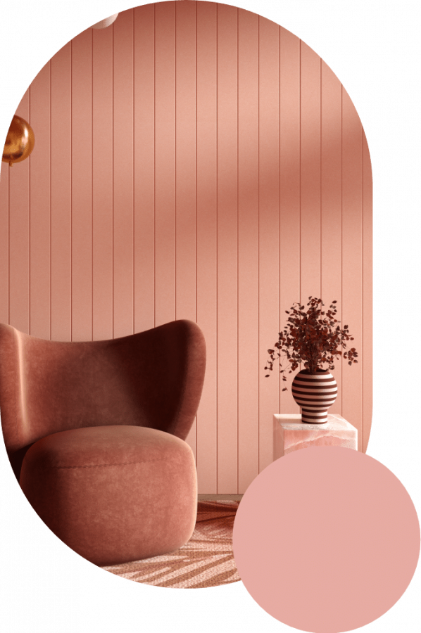
Forced indoors, we come to terms with the ease and comfort of our homes. The safety of being able to shut the door and know that we can be calm and quiet reflects a shift from the outer to the inner worlds, and translates visually into the colours and emotions associated with being cocooned. The palette that follows is soft, unassuming and colours blend harmoniously; light pinks, minty greens, dusty purples and misty greys. See this palette alongside design trends such as round, non-threatening furniture, homewares featuring engineered wood, undulating patterns in textiles, and soft-focus gradients used in fashion as well as branding.
Color Description
The result of the development is a versatile pink with quiet warmth and subtleness that doesn’t overpower. A soft mid pink with a yellow undertone.
Emotion and Feeling
Representing youth, romance, tenderness and domesticity, pink makes you feel calm. It’s inherently sweet, cute and charming, but also very safe.


Color Vernacular Volume 2
With this season seeing nine new colors join our offering, we wanted to use this opportunity to take a deep dive into the stories, insights and emotions that drove this selection. Let us take you on a colorful journey and sensory experience.
Order your sample pack


